

140k - Revenue
1.7k - Orders
7 Million - Unique Users
140k - Revenue 1.7k - Orders 7 Million - Unique Users
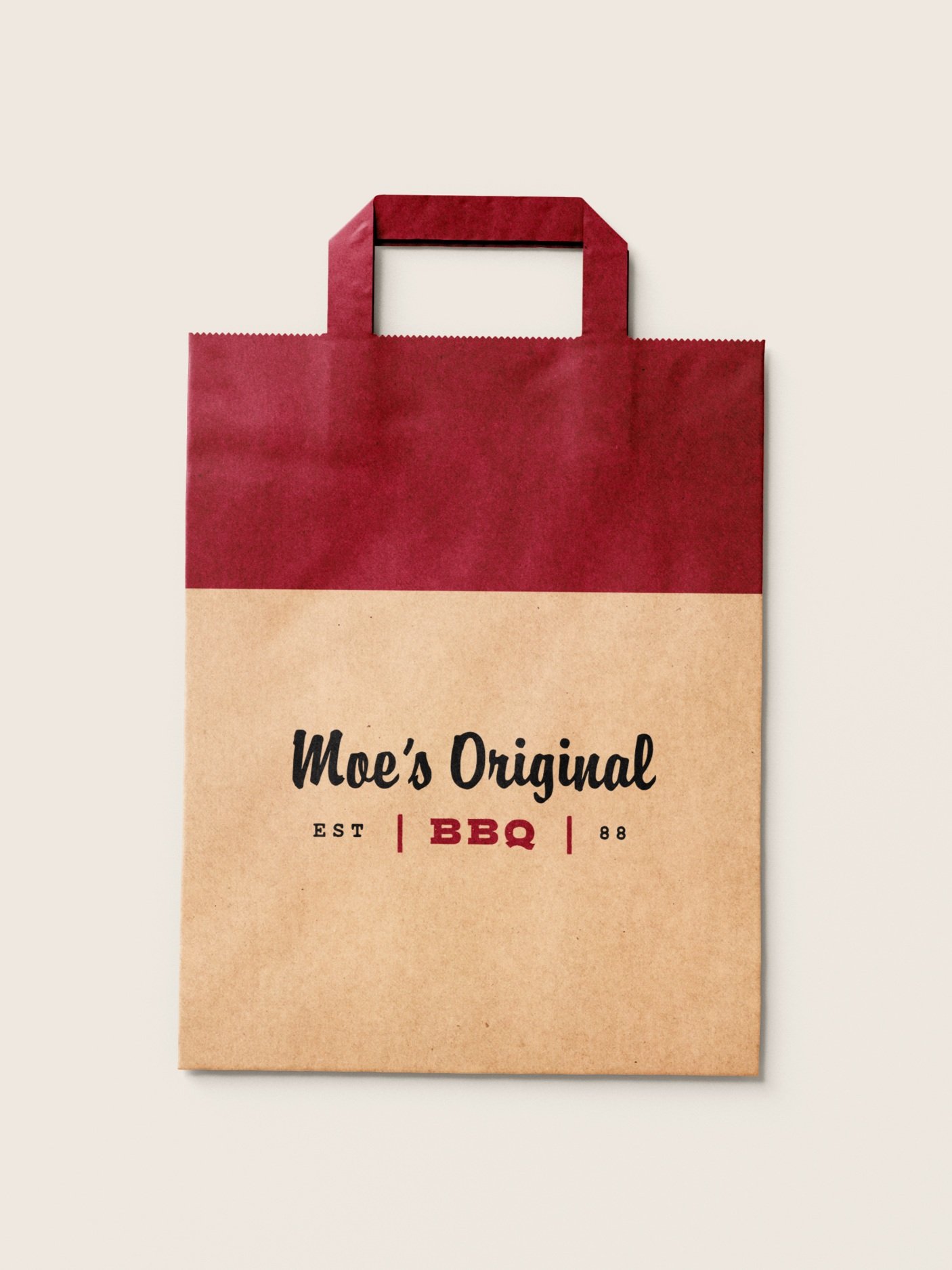
Moe’s Original BBQ invites guests to drink and dine in a timeless, social setting. The brand comes to life through the legacy of Moses Day, a legend of Alabama BBQ. Rooted in authenticity, Moe’s is an invitation to slow down, gather, and savor what matters.
Over the course of six months, I was solely responsible for leading the full user experience, from initial stakeholder alignment to final delivery, while also owning all art direction and photography. Every visual, from the raw ingredient compositions to the moody, atmospheric portraits, was crafted to evoke curiosity and warmth without pretense. The copy follows suit, never taking itself too seriously and always grounded in human connection.
This is more than just BBQ. It is a place, physical and digital, where everyone belongs. A reminder that life tastes better when shared.
Evolving a brand
Modern brands don’t stand still. They adapt, refine, and reimagine to stay meaningful in a changing world. The Moe’s website had served its purpose well—but the world had moved on, and it was time the digital experience did too. To meet today’s expectations and tomorrow’s opportunities, we needed to evolve. That meant taking a clear-eyed look at what was working, what wasn’t, and rebuilding the site to better reflect the heart of the brand—and the people it serves.


Competitor Analysis
To better understand the landscape Moe’s operates in, we studied the Gartner Digital IQ Index for Fast Food. This helped us examine how modern consumers interact with food brands in a digital environment. The data offers a clear view of where leading brands are focusing their energy to meet customers where they are. For example, Chick-fil-A shows strong engagement on Instagram and Facebook while prioritizing seamless, omnichannel experiences that bridge digital and physical touchpoints.
Average Session Duration: 45–90 seconds (if designed for efficient ordering or info distribution)
Bounce Rate: Below 50% is ideal
Mobile Optimization: 70%+ of traffic typically comes from mobile devices
Page Speed: Under 3 seconds load time is critical for conversion

Understanding the User
Pain Points
Inconsistency: Dislikes when food quality varies between visits
Atmosphere: Finds overly touristy or gimmicky spots off-putting
Wait Times: Gets frustrated by long lines without a reservation system
Motivations
Experience: Enjoys sharing a great BBQ meal with friends or discovering new spots on his own
Exploration: Always on the hunt for the “hidden gem” in a city’s food scene
Connection: Appreciates when restaurants showcase local heritage through their BBQ offerings.
Quote:
"The best BBQ places don’t just serve great food; they tell a story with every bite."
Creating the Moes EXPERIENCE
Designing the Moe’s experience online meant capturing the soul of Southern hospitality in a digital space. It wasn’t about recreating the restaurant—it was about translating its spirit. We focused on clarity, warmth, and momentum, building an experience that welcomes guests, moves them forward with intention, and reflects the brand’s roots in community and craft.
Website Goals
Mobile Optimization: Ensure the website is mobile-friendly for on-the-go exploration.
Fast Load Times: Prioritize speed, especially for high-resolution images and ordering features.
Easy Navigation: Use intuitive navigation so Jake can quickly find menus, locations, and online ordering without digging through pages.
Building off Moes BBQ rich heritage, Creative Trajectory evolved the revered BBQ franchise with an updated visual identity, a new brand direction, a clear tone of voice, and authentic art direction.


Branding
Moes falls into the Quick-Service and Fast Casual Restaurant category, but it’s food is anything but Quick smoking starts at 6 am every morning for an authentic BBQ experience. In our process, every asset and interaction must support the story and enhance the overall experience. We used the textures and palettes from the food to enhance the online experience and brand story.

Wire Frame Sketch
Like the food itself, bold, approachable, and full of character, the digital experience for Moe’s Original BBQ needed to deliver high-quality information with speed and clarity. Information architecture became a cornerstone of the design, ensuring guests could navigate seamlessly from curiosity to action.
We recognized that most guests were already using Google Maps to find their nearest Moe’s location, so we designed the site to meet them where they are, bridging that last mile to the correct store and integrating directly with Toast for effortless online ordering.
From showcasing the menu to highlighting catering capabilities, every element was structured with purpose. The result is a site that reflects Moe’s spirit, serves guests intuitively, and reinforces the brand's hospitality-first ethos in every click.

Task Flow
We redesigned the task flow for Moe’s Original BBQ to prioritize speed, clarity, and local relevance. Most visitors come to the site looking for a nearby location, so we streamlined access to the Locations page, integrated Google Maps for easy navigation, and connected Toast for seamless online ordering. We also structured the menu and catering flows to feel intuitive and effortless, reinforcing Moe’s commitment to hospitality from the very first click.

Mid-Fidelity Prototype
A distinct aspect of the mid-fidelity prototype was our decision to begin with asset capture. By using real photography from the outset, we brought authenticity to every stage of the process. Close collaboration with stakeholders ensured that each design decision was grounded in reality, allowing the prototype to reflect not only the structure of the site, but the creative intent behind it.


Takeaways
This project was shaped through close collaboration with a thoughtful partner and an engaged stakeholder team. Together, we transformed a complex set of requirements into a streamlined experience that is clear, purposeful, and rooted in the brand’s story. The physical store served as both inspiration and constraint, requiring every design decision to balance functionality with narrative clarity.
A key metric we tracked was time spent on site, averaging just 51 seconds. That was not a compromise; it was the objective. The site was not built to hold attention but to guide it. It was designed to get guests where they needed to go, without friction or distraction. That clarity of purpose is paying off. Today, mobile engagement accounts for 30 percent of all traffic, a sign that the experience is working where it matters most—in the hands of the guest.